Why was the "Discard" button moved from the bottom right of the editor to the bottom left?
What's the purpose?
It just messes with my muscle memory.
(I'm on desktop if that's required info)
1 Like
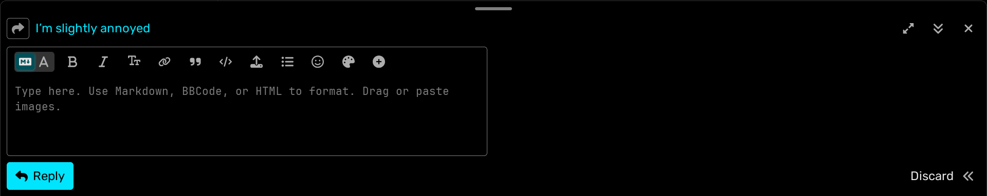
Yeah I noticed the UI changed a bit. But, we can do this now:
You've got a friend in me
Well shit, nevermind.
Disregard this post.
(Seriously, though, why was it moved?)
I honestly both understand and don't understand why the Discard button was moved. I understand because it was a bit far from the rest of the stuff you usually click, but I don't understand why it was moved so close, because now a misclick clicks on it.
I'm mainly just annoyed at it messing with my muscle memory.
It's like tech companies changing things that are perfectly fine for no reason.
(Wait — was this just a general update to Discussions UI?)
Yeah, they removed a lot of color from the edges of the replying thing and also the Discard button was moved and recolored to white (RIP trashcan symbol)
That's dumb
I don't like it
Changing stuff that works just fine and making it slightly worse
2 Likes
"If it ain't broke, don't fix it"
They "fixed" it
Messing with my muscle memory and removing a little bit of personality with removing the trashcan and colour
Lucky for me I’m new so I have no muscle memory ![]()
Good 4 u
I'm sorry, what the hell is "insert math"
1+1
I'm-the-chaotic-and-femboy-knight
What is "add wrap"
No seriously
How do I use it
Magic wrap maybe?
Why isn’t it doing anything
Wrap is part of how colors work
Friend + inside me = papyrus knight
Interesting
How do I do that?