Hi, I have received a response.
"using orca on linux: the exact read out i got was as follows:
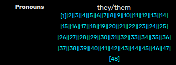
Pronouns, heading 3. They/them. left bracket 1 right bracket link. left bracket 2 right bracket link. left bracket 3 right bracket link. [...and so on]
orca reads this line by line, so in my instance it stops reading at 10 and needs to be manually moved down a line. trying to leave the field proved difficult in of itself as it sounded like (key presses indicated with ↓):
superscript. ↓ superscri– ↓ super– ↓ super– ↓ Battle information, heading 2
as i am not visually impaired enough to require a screen reader myself i can't speak too much (perhaps there are settings i could've changed to condense the readout or keys i could've pressed), but the large volume of links, especially in a tight grid that may be hard to mentally map for key navigation without sight, is in my opinion an accessibility issue
one way to fix this would be to concatenate the sources into a single reference (especially as 46 out of the 48 are not re-referenced later, so the last 2 could be left alone for a reasonable 3 links), either making one giant reference that includes all the quotes, or linking to a new page on the wiki containing them (e.g. "Due to accessibility concerns, a full list of quotes can be found on Kris Dreemur/Pronoun Citation")
more detail on what i mean on combining: references 1-46 become the singular reference 1, and then 47 and 48 are automatically bumped down to 2 and 3 by the wiki renderer. this leaves 3 easy to navigate links."
I do think the solution you've suggested could maybe work? But it’s just a maybe. We don’t know for sure it actually helps for everyone. It’s possible it just makes the issue worse.
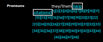
Also, I think the skip button’s purpose is just unclear. I feel like most users are gonna be confused on what the link is even there for. And if you are using a screen reader, you will probably not be able to see the giant list of citations. You’ll only know it’s long when you’re in the middle of it, and by then it’s too late.
I think that just having it be one link (or like a reasonable amount) is more effective, cleaner, more conventional, and less confusing. It doesn’t necessarily have to be a separate page if that’s an issue, it could just be a section in the article. But based on the person’s description I think reducing the amount of links is really the best solution.
Is there any reason you wouldn’t want to use the solution of linking to a separate page that I initially proposed? Knowing those reasons will help me come up with a suitable solution.